Details section
Use the details component to display a small panel with a title and collapsible details section.
Use the details component to display a small panel with a title and collapsible details section.
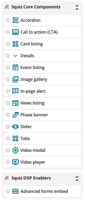
Screenshot preview:

It’s easy to start using a DXP Core Component. All you need is Component Service enabled for your DXP. Then you can access the Components within a Content or Standard Page asset of your CMS.

- When on the Content screen of your Page asset, add a new Component.
- Select the Component.
- Configure the Component.
| Type | Component |
|---|---|
| Component type | Content template |
| For |  CMS (Matrix) CMS (Matrix) |
| Version | 1.0.0 |
| Min. Matrix version | DXP |
| Framework | Generic |
| Documentation | |
| Training | |
 Squiz Marketplace